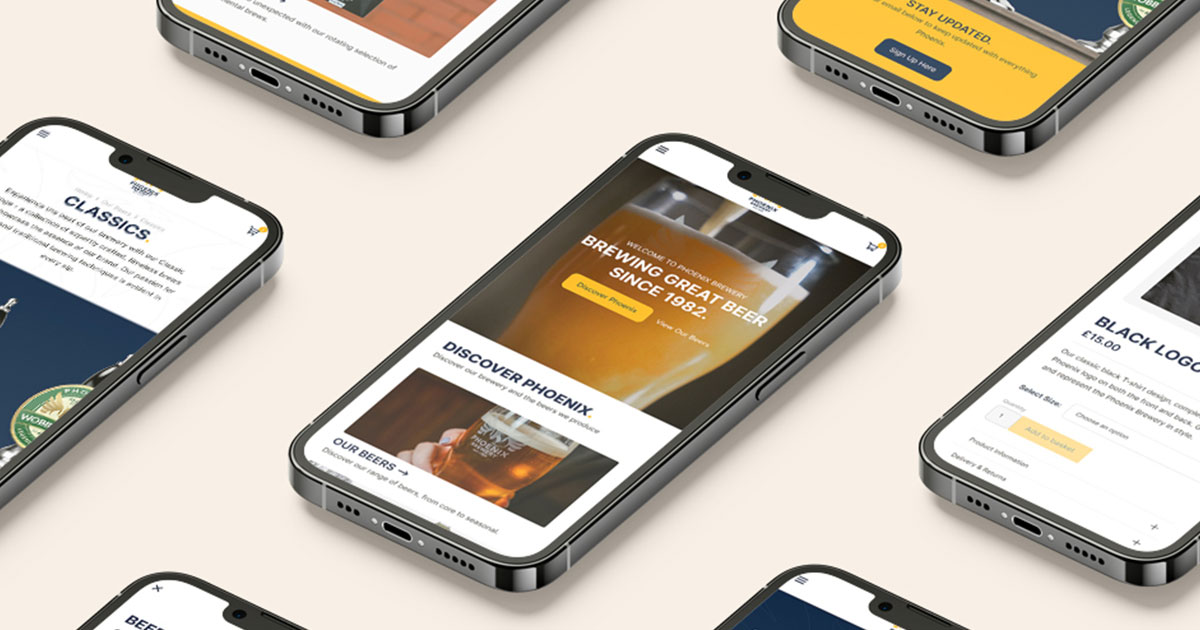
In today's digital age, our interaction with websites is not limited to desktop computers like it used to be. Tablets, smartphones, and other mobile devices offer different ways to access web content. In fact over 55% of website traffic comes from mobile devices, and this number will continue to rise.
This means responsive website design has emerged as a fundamental approach to ensure a seamless experience across various devices. Here's a detailed look at responsive design, its underlying principles, why it's crucial, and why a mobile-first approach is vital.
What is Responsive Design?
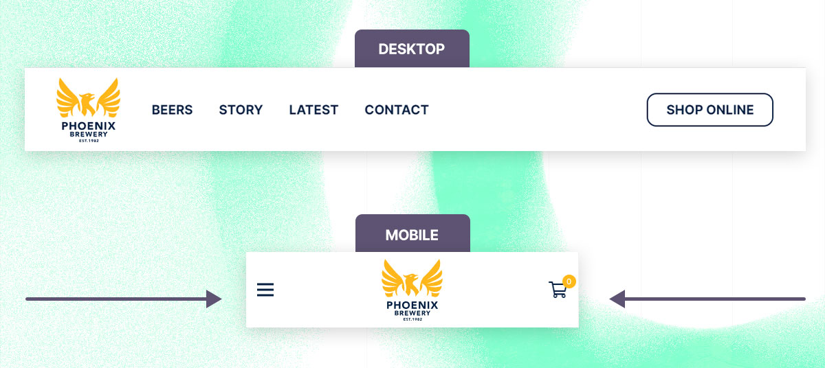
Responsive design is an approach to web design and development that aims to make websites function effectively on various devices and screen sizes. In a responsive design, the layout, images, and other elements adjust automatically to fit the screen, providing an optimal viewing experience for the user.
One element of a website that highlights this best is the navigation. Navigation menus should be easy to use on all devices, from desktop to mobile. Dropdowns and large menus may need to be simplified or restructured for mobile screens, possibly using the "hamburger" menu pattern or other collapsible options.
The Importance of Responsive Design
The importance of responsive website design cannot be overstated in today's digital landscape. Here are some key reasons why responsive design is crucial:
- Enhanced User Experience: A responsive design ensures that your website provides an optimal viewing experience across a range of devices. Users won't have to constantly zoom in and out or scroll horizontally, which greatly enhances their experience and engagement with your site.
- Improved Search Rankings: Search engines like Google give preference to mobile-friendly websites. Google's mobile-first indexing is a clear indication that mobile responsiveness is an SEO ranking factor. A responsive design can, therefore, improve your site's visibility in search engine results.
- Mobile Traffic: With the ever-increasing use of smartphones and tablets, a substantial amount of web traffic comes from mobile devices. A responsive site ensures that you capture this audience effectively.
- Better Conversion Rates: A user-friendly design contributes to better user engagement and experience, which in turn leads to higher conversion rates, whether it's sales, sign-ups, or any other action you want users to take on your site.
- Competitive Advantage: Many companies still haven't fully adapted to the mobile-first world. Having a responsive website gives you a significant edge over competitors who are not as easily accessible on all platforms.
The Mobile-First Approach
The "Mobile-First" approach is a web design and development strategy that prioritises the design and implementation of the mobile version of a website before scaling up to larger screens, like tablets and desktops. Essentially, designers and developers start by crafting the experience for smaller screens and simpler devices, ensuring optimal performance and usability, and then progressively enhance the experience for more powerful devices with larger screens.
Here are some key elements of the mobile-first approach:
- **Simplicity: **Starting with a mobile design forces you to prioritise essential features due to limited screen space. This helps in creating a cleaner, more focused design and user experience.
- **Performance: **Since mobile devices often have less processing power and can be on slower networks, the mobile-first approach emphasises performance optimisation, including faster load times and efficient use of bandwidth.
- Usability: Mobile-first design pays special attention to the user interface, ensuring that it's touch-friendly with easily tappable buttons, efficient use of screen space, and intuitive navigation.
- Content Hierarchy: Limited screen size also means you have to think critically about content hierarchy. What’s most important should come first and be most easily accessible.
Conclusion
Responsive design is no longer a luxury; it's a necessity in today's interconnected world. Embracing a mobile-first approach amplifies the benefits, putting user needs at the forefront and adapting to the evolving landscape of web access.
Investing in responsive design not only caters to the current demands but also future-proofs your website for upcoming trends and technologies. In a world where the first impression matters, a well-designed, responsive site can set you apart and ensure that your visitors enjoy a unified and engaging experience across all devices.