19th November, 2024
How to Identify When Your Website Needs a Redesign

Your website isn’t just some online business card, it’s the digital face of your business, when done right. It’s where first impressions are made, where leads are nurtured, and where business is won, or lost. If your website isn’t pulling its weight, a website redesign might be exactly what you need to stay competitive and relevant.
Imagine a potential customer clicking on your site only to be greeted with outdated designs, clunky, hard to understand navigation, or slow load speeds. What message does that send?
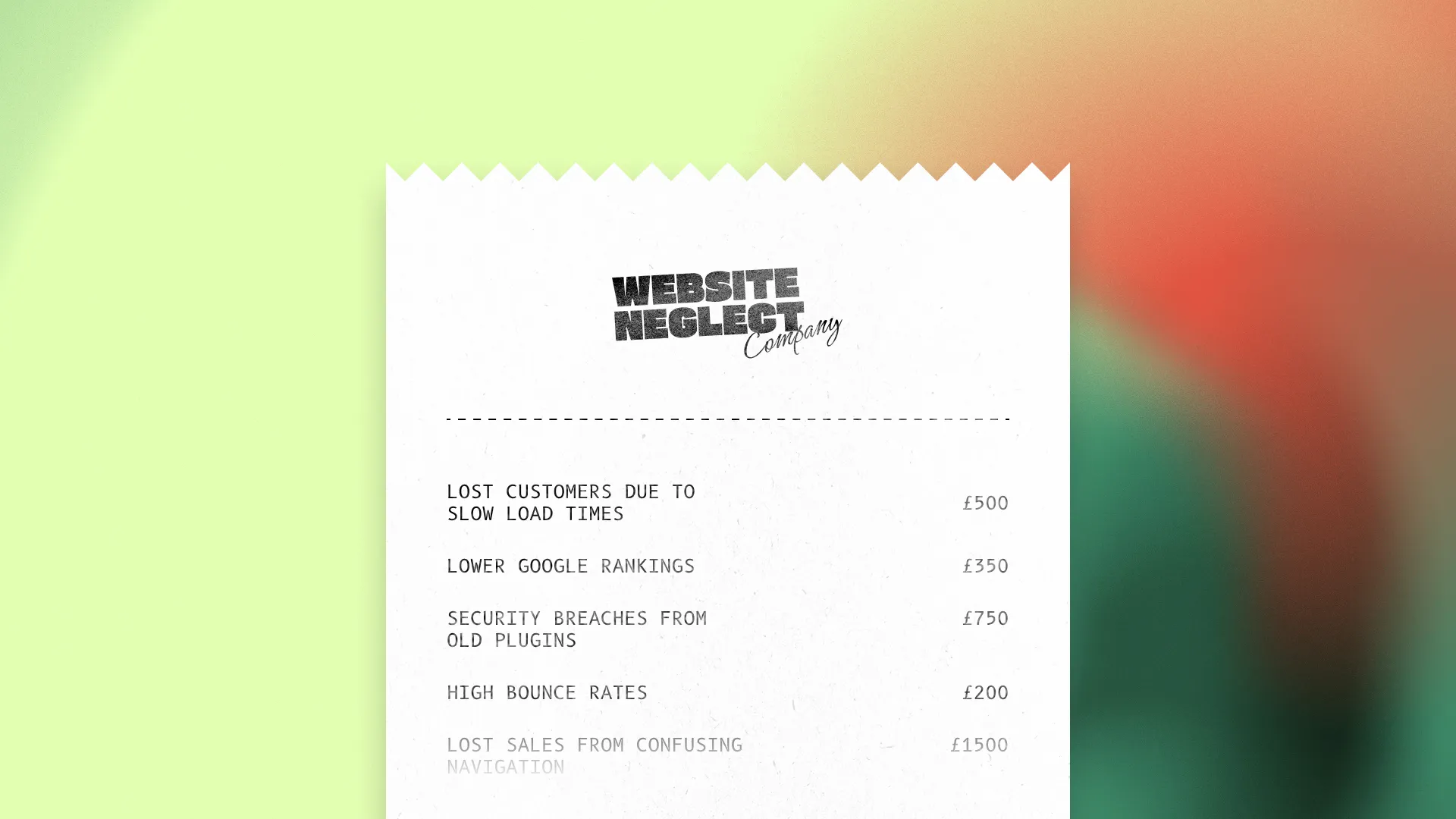
You could already be losing a handful of potential customers every month who give up out of frustration, whether it’s waiting for your website to load or struggling to find what they need. Websites age faster than you think, and the longer you ignore the warning signs, the more damage you’re doing to your business's perception, and bottom line. A website redesign is often the most effective way to fix these issues and regain lost opportunities.

Why Your Website Matters More Than You Think
Before we dive into the signs of an aging website, and how to know if you need a website redesign, let’s take a moment to understand why your website is one of the most critical tools for your business success.
The Core of Your Online Strategy
Your website is more than just a URL on the web. A well designed website acts as the hub for all your online activities as a business, from social media campaigns to email marketing. It’s where the majority of your potential customers land after seeing your ads, receiving your emails, or Googling your services. If it fails to deliver, all those efforts are wasted, and a website redesign becomes a critical step to make the necessary improvements.
Your Always-On Business Tool
Think of your website as your hardest working team member, it never clocks out. It’s where people and potential customers learn about your business, explore your services or products, and decide whether to trust you. A website that’s outdated or underperforming is like a salesperson who forgets their pitch, it just doesn’t work. A website redesign can ensure it performs at its best around the clock.
Builds Credibility and Authority
An up-to-date, well-maintained website tells customers that you care about their experience and pay attention to detail. It reflects professionalism and reliability, creating a sense of trust even before a visitor interacts with you directly, which is what you want. A modern, thoughtfully designed website signals that your business is competent, current, and ready to meet customer needs.
Helps You Understand Your Customers
Your website isn’t just a tool for visitors, it’s a tool for you. If you have access to your site's analytics, they can show what people are searching for, how they find you, and what they do on your site. A website redesign can help you better leverage this data, allowing you to improve and grow your business using real insights, not guesswork.
Enjoying this article? 💌
If you're finding this post insightful, why not get more like it delivered straight to your inbox? It’s free, and I promise, no spam ever!

The Cost of Ignoring Website Issues
The Hidden Threat to Your Business
It’s easy to overlook website issues because they aren’t always obvious, especially when you're busy running your business. But every broken link, slow page, or confusing layout is quietly chipping away at your reputation. Over time, these small cracks turn into massive gaps that competitors will happily fill. A website redesign can address these vulnerabilities before they spiral out of control.
At some point, a potential customer searching on Google with the intent to do business likely landed on your website. If they had a poor experience, they probably went straight to a competitor. This brings me to my next point.
Missed Opportunities
Your website is your round-the-clock opportunity generator, when it works that is. When it doesn’t, leads slip through your fingers. An outdated or buggy site can turn away potential customers before they even get the chance to learn what you offer. It’s not just a missed opportunity, it’s an open door for competitors to swoop in.
Outdated Technology Poses Risks
Using old plugins on WordPress sites or unsupported frameworks doesn’t just slow your site, it makes it vulnerable to security breaches. Hackers purposefully target outdated websites, putting yours and your customers’ data, as well as customer trust at risk. A website redesign can be the perfect opportunity modernise your website's technology, enhancing security and protecting your reputation.
I’ve come across countless hacked websites during my time as a freelance website designer. Websites that redirect visitors to malicious or spam-filled pages, damaging both your reputation and your customers' trust. Plus, Google may penalise you for not having modern security measures like HTTPS (a valid SSL certificate).
Decreased Search Engine Visibility
Search engines favour websites that provide good user experiences, are mobile-friendly, and load quickly. If your site doesn’t meet these criteria, Google is less likely to rank it highly. This means fewer people will even find your business in the first place.

Signs Your Website is Outdated
1. Your Website Looks Like a Relic from the Past
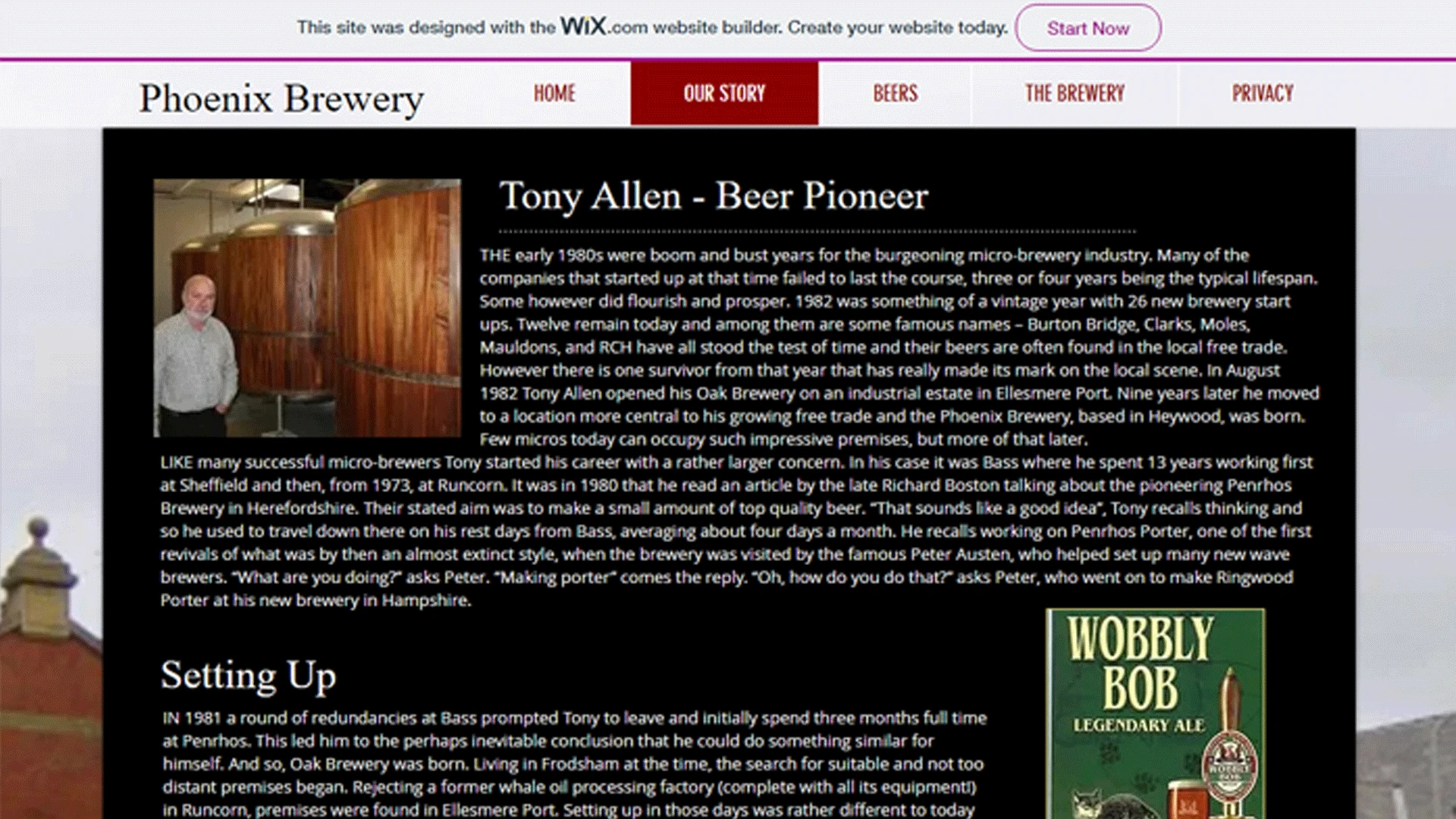
Does your site still have gradients from the early 2000s, ugly drop shadows, or clunky Flash elements? If it looks like it belongs in a museum of 2005 web design, you’re in trouble. Modern users expect sleek, polished, and up-to-date visuals. A website redesign can breathe new life into your design, making it appealing to today’s audiences.
A study by Stanford University revealed that 75% of users judge a company's credibility based on its website design. Outdated visuals send a clear message: your business isn’t keeping up. Investing in an updated, professional design isn’t just about aesthetics, it’s about building trust and credibility with your audience.
2. Design Trends Have Changed, But Your Site Hasn’t
Web design evolves rapidly. What worked five years ago can now look tired and unprofessional. Visitors can subconsciously equate outdated design with outdated thinking or services, and no business can afford their would-be customers to have that perception.
However, staying timeless doesn’t mean chasing every design trend. That's where a good web designer comes into play. Instead, focus on clean, simple layouts and intuitive navigation that won’t age as quickly. A timeless design ensures your website remains effective and visually appealing, even as fads come and go.
3. Your Competitors’ Websites Are Better
When potential customers compare your website to a competitor’s and theirs looks more appealing, or is easier to use, they’re likely to choose them, even if your services are better. It’s not fair, but in the digital world, things like this matter.
A 2023 report by GoodFirms found that 73% of users said a well-designed website directly influences their buying decisions. This means that even if you have the best services in the market, a poorly designed website could lead users to assume otherwise. Keeping your site visually competitive ensures you’re not losing business simply due to aesthetics.
A well-executed website redesign ensures you don’t lose business simply because of appearances.
4. Visitors Can’t Find What They’re Looking For
Your website should guide visitors effortlessly. If users have to hunt for information or navigate confusing menus, they’ll leave. Fast. Your site isn’t a puzzle, it’s a tool to deliver value quickly.
I think this is arguably one of the most important aspects of a website. Visitors don’t always realise it, but their primary goal is simplicity. They want the information they need presented clearly and efficiently. Whether they’re looking for your contact details, pricing, or product information, make it as intuitive as possible. Anything less, and you risk losing them to a competitor who prioritised user experience.
This brings me to my next point.
5. Your Navigation is Confusing or Overloaded
Too many options can overwhelm users, while too few can leave them stranded. A well-designed navigation menu acts like a GPS, getting users where they need to go without frustration.
Aim for a navigation menu that is clear and simple to use. Use clear labels that describe exactly where users will land, no vague terms like "Resources" or "Solutions" unless they’re widely understood. Avoid the trap of overloading your menu with every possible page. Instead, organise your navigation into logical categories and use dropdowns sparingly for subcategories. Simplicity here translates directly into usability.
6. Clunky Layouts That Frustrate Users
A cluttered layout isn’t just ugly, it’s a barrier to engagement. Misaligned text, unresponsive buttons, or overly complex forms can make users abandon your site before they even start exploring.
Think of your layout as the structure that holds your content together. A poorly structured layout confuses visitors, while a clean and logical one invites them to stay. Key elements like headlines, images, and buttons should guide the user’s eyes naturally through your page. Test your layout on different devices and browsers to ensure it performs well everywhere, especially on mobile.
7. Pages That Take Forever to Load
Nobody waits around for a slow site to load anymore. If your page takes more than three seconds, you’re losing visitors, plain and simple.
There’s some debate about whether Google actively penalises slow-loading websites, but all signs point to yes. Google prioritises sites that deliver a smooth, user-friendly experience, and slow loading speeds can tank your "Core Web Vitals" metrics. A sluggish site doesn’t just frustrate visitors, it also costs you visibility in search rankings. It’s a double hit you can’t afford to ignore.
Platforms like GTmetrix and Google PageSpeed Insights can reveal exactly where your site is lagging. Armed with this data, you (or your web developer) can address speed issues effectively, from compressing images to enabling caching.
For more insights, check out why slow load times could be driving your customers away where I dive deeper into this critical issue and how to fix it.
TLDR: So What Are The Signs?
Your website isn’t just a digital asset, it’s the face of your business and often the first point of contact for potential customers. If it’s outdated, slow, or confusing to navigate, you’re losing trust, leads, and revenue. Here are the key signs your website needs a redesign:
- Outdated Appearance: Gradients from 2005, clunky Flash elements, or tired designs can make your business look out of touch.
- Poor Navigation: Confusing menus or too many options leave users frustrated and heading for competitors.
- Slow Loading Times: If your site takes over three seconds to load, visitors won’t stick around.
- Bad User Experience: Clunky layouts, unresponsive buttons, or hard-to-find information push users away.
- Competitors Look Better: A well-designed competitor site can steal customers, even if your services are superior.
A modern, fast, and user-friendly website isn’t just nice to have, it’s essential to compete, grow, and win in today’s digital-first world.